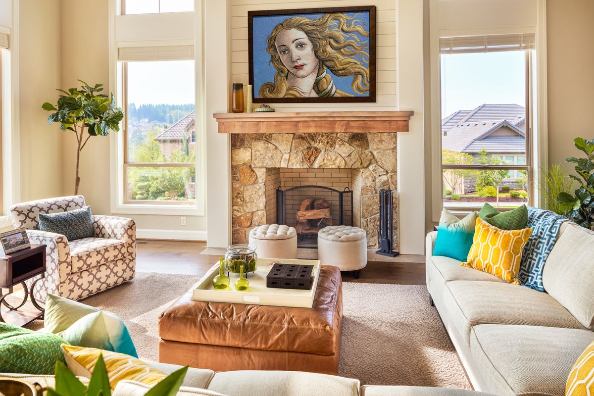
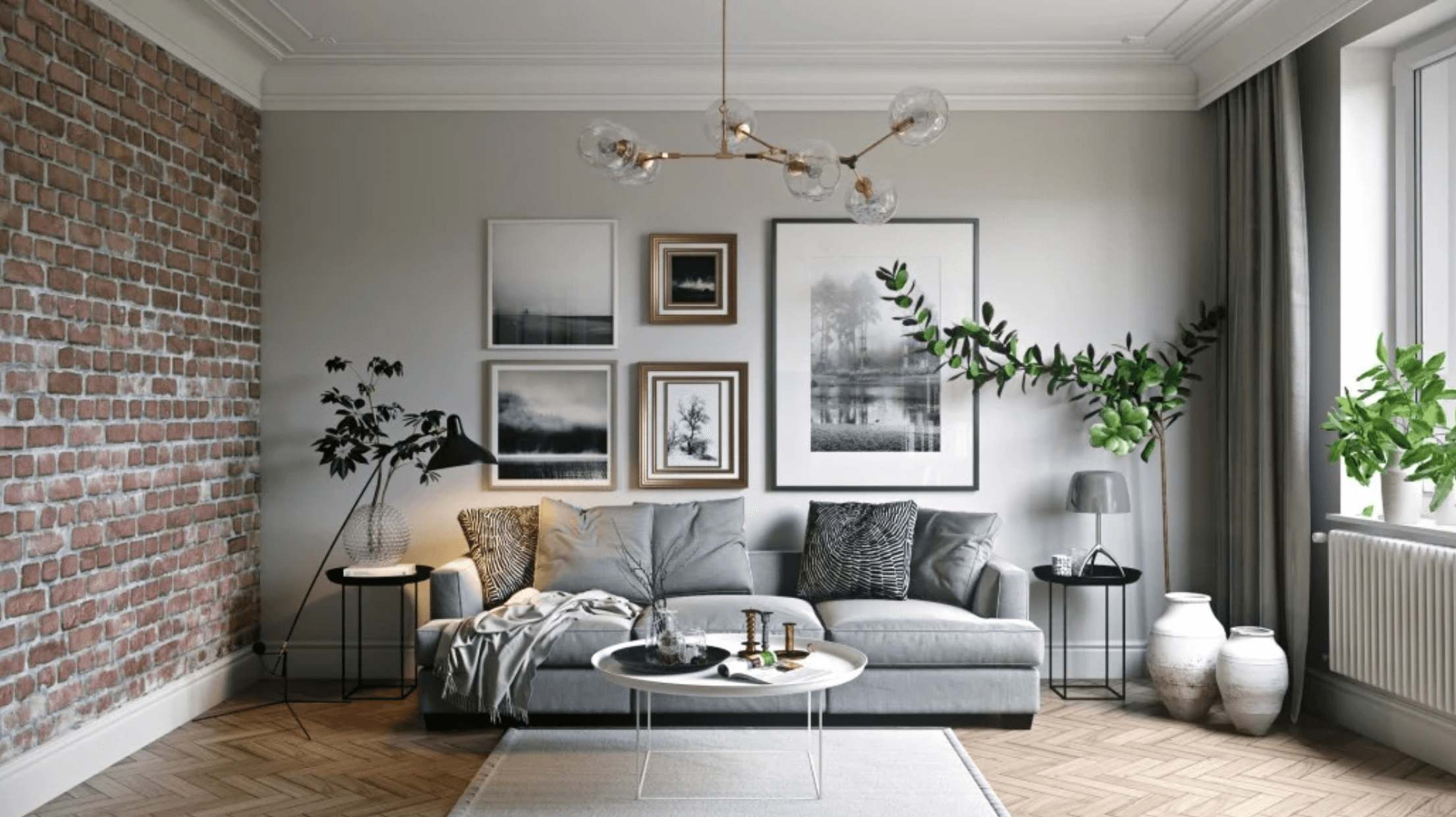
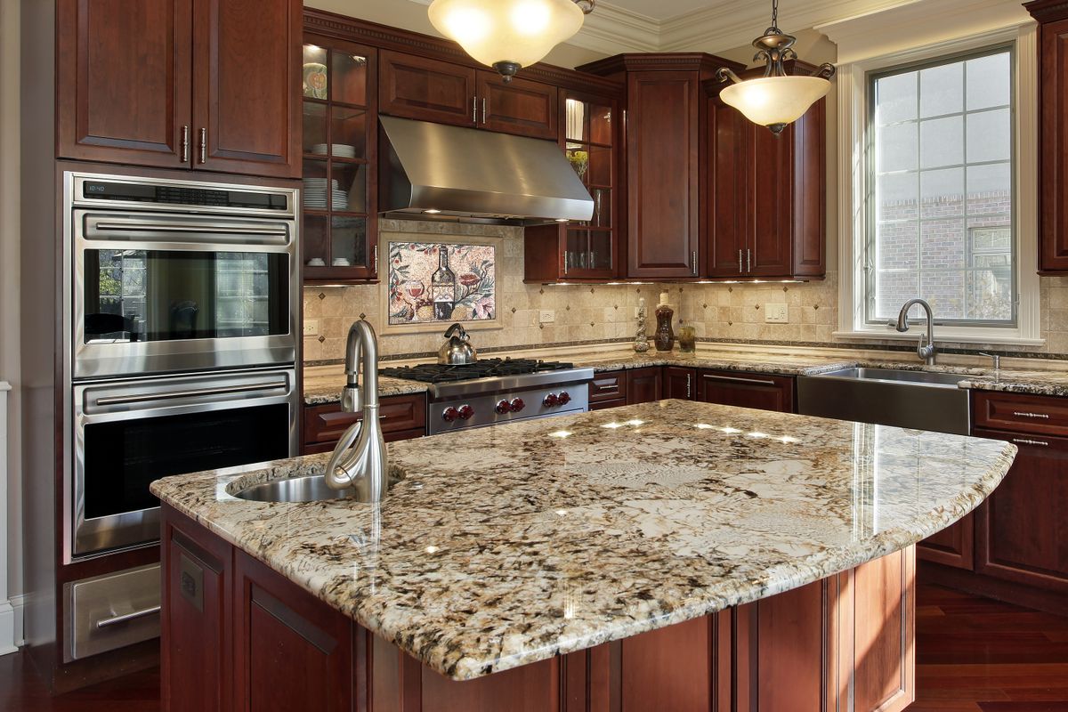
If your social media algorithm tends to flood your feed with interior design content, you may have heard of a design theory called ‘unexpected red.’ While the daring nature of incorporating red into a space certainly isn’t anything new, this particular theory explores its use a bit further.
Coined by designer Taylor Migliazzo Simon, ‘unexpected red’ posits that adding something red to a room where one wouldn’t traditionally think to use it has a transformational effect. In essence, her take on red is that it can instantly improve a space’s aesthetic.

Source: Mosaic Natural
The key here is that it doesn’t have to be a large statement piece or a whole room designed around the color red. It’s actually quite the opposite. In an interview with the New York Times, Migliazzo Simon stated the use of red could be something as small as a picture frame or lampshade.
Is there any validity to this theory or is it just another passing social media trend? Let’s explore…
Color Theory and Unexpected Red

At the most basic level of color theory, red is a warm color as well as a primary color. Warm colors also include orange and yellow, but can expand into tans and browns as well. As a primary color, red cannot be made from mixing other colors, but can be combined with other colors to create secondary and tertiary colors. All this is to say, red is a pretty big deal in the color world.
While it can evoke strong emotions, its meaning can fall on opposing ends of the spectrum. We often associate the color red with anger, but also love. It can indicate a warning or be used to call attention to something exciting. Its meaning varies greatly among different cultures as well, but can have both negative and positive connotations. When used properly, however, it is a powerful interior design tool.
Color Palette Methodology

Now that we know a bit more about the color red, let’s see how the ‘unexpected red’ theory holds up when it comes to creating traditional color palettes. They range from monochromatic—using varying shades of just one color—to custom, which doesn’t follow any prescribed rules of color theory. There are also analogous palettes that are created using three colors next to one another on the color wheel, as well as complementary palettes that combine colors that fall opposite one another on the color wheel. This isn’t an exhaustive list, but does provide a sense of how aesthetically pleasing color palettes can be created. Red could be easily used in any of these palettes.
It’s when you dive deeper into the more complex methods of creating a color palette that you can see how the use of ‘unexpected red’ may apply. One thing you’ll notice in this series on color theory and design is the frequent use of red in its color palette examples. This is especially true for colors that you wouldn’t intuitively combine with red, such as lavender or sage green. Based on the color wheel and color theory, however, it is possible to pull these combinations off.
How to Try the Unexpected Red Trend

Source: Mosaic Natural
This trend is a whole lot easier than you might think. Remember, this is not about designing an entire space around the color red. The point is that the addition of red to a space is almost an afterthought, but one that turns out to be the cherry on top, if you will.
It is the use of red in a way that may feel unnatural or uncomfortable, but against all odds, it works. Ok, maybe not against all odds, since we already know the role that color theory plays here.
There are a number of ways to incorporate red into your interior design in an unexpected way. This could include flooring, furnishings, window treatments, decor, furniture, and practical items like clocks, books, and vases.
Save this trend for a room where red isn’t already included in the color palette. Start by adding a small item and, if you like what it does to the space, commit to a larger piece to really shift the focus.
Will Unexpected Red Stand the Test of Time?

The problem with trends—especially ones made popular by social media—is that they sometimes come and go as quickly as they appear. Overhauling the interior design of your space is a big commitment and keeping up with each new trend is nearly impossible.
The good news about the ‘unexpected red’ trend is that red has a bit more staying power than some of the more recent trending colors of the last decade or two. Barbie pink came and went, as did rose gold and Tiffany blue. Red, however, has the advantage of being a primary color, giving it a more timeless feel than other hues.
At the end of the day, what you choose to incorporate into your interior design is completely up to you and your aesthetic preferences. It’s low stakes, so worth giving a shot, but if you aren’t into it there’s surely another trend peeking around the corner waiting for its chance in the limelight.


